table.tbl_content {
 border-collapse: collapse;
 width: 95%;
}
table.tbl_content th, table.tbl_content td {
 padding: 10px;
 border: 1px solid #999;
}
table.tbl_content th {
 background-color: #f5f5f5;
 text-align: center;
 width: 30%;
 font:#333333;
}
@media screen and (max-width: 480px) {
 table.tbl_content { border-top: 1px solid #999; }
 table.tbl_content thead { display:none; }
 table.tbl_content tr {
  display:block;
  margin-bottom: 0px;
 }
 table.tbl_content th {
  display: block;
  width: 100%;
  font:#333333;
 }
 table.tbl_content td {
  display: block;
  text-align: left;
  width: 97%;
  margin-left: 3%;
  padding: 13px;
 }
 table.tbl_content td:nth-of-type(1):before {
  font-weight:bold;
  content: attr(sub1)"";
  white-space: pre;
 }
 table.tbl_content td:nth-of-type(2):before {
  font-weight:bold;
  content: attr(sub2)"";
  white-space: pre;
 }
}
CSSの記述
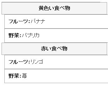
<table class="tbl_content">
<thead>
<tr>
<th></th>
<th>フルーツ</th>
<th>野菜</th>
</tr>
</thead>
<tbody>
<tr>
<th>黄色い食べ物</th>
<td sub1="フルーツ:">バナナ</td>
<td sub2="野菜:">パプリカ</td>
</tr>
<tr>
<th>赤い食べ物</th>
<td sub1="フルーツ:">リンゴ</td>
<td sub2="野菜:">苺</td>
</tr>
</tbody>
</table>
HTMLの記述
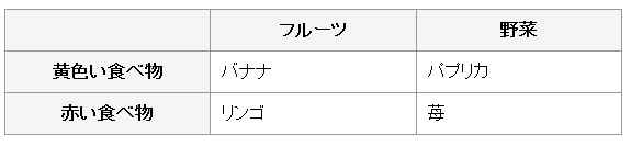
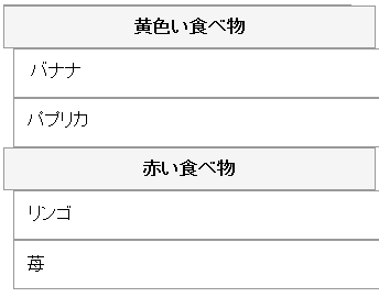
以下、縦2レコード、横2カラムの表のレスポンシブ対応した結果のデモです。PCとスマホで見比べてみてください。PCでブラウザのサイズを変更しても構いません。| フルーツ | 野菜 | |
|---|---|---|
| 黄色い食べ物 | バナナ | パプリカ |
| 赤い食べ物 | リンゴ | 苺 |